Digital transformation of a pharmacy chain
- UX/UI Design
- Front-End Development
- Figma
- Angular
- HTML / CSS / Javascript
- jQuery
- Cordova / Ionic
- .NET / Telerik
The client was a chain of more than 300 pharmacies in Portugal, with no digital sales channel. The main goal was to transition this network to a digital model, allowing its customers to shop through an online store, a mobile app or self-service kiosks located in the pharmacies. I was responsible for creating the proof of concept, and the UX/UI was also in my hands, establishing the visual and interaction foundations for the digital ecosystem. Later on, I was part of the front-end team that developed the solution.
The Challenge
The most critical point of the project was designing an ecosystem with four distinct touchpoints: online store, app, kiosk and backoffice. Each platform had very specific technical constraints and contexts of use. The goal was for it to work as a single, coherent product: for the end customer, for the pharmacies and for the client’s internal team.
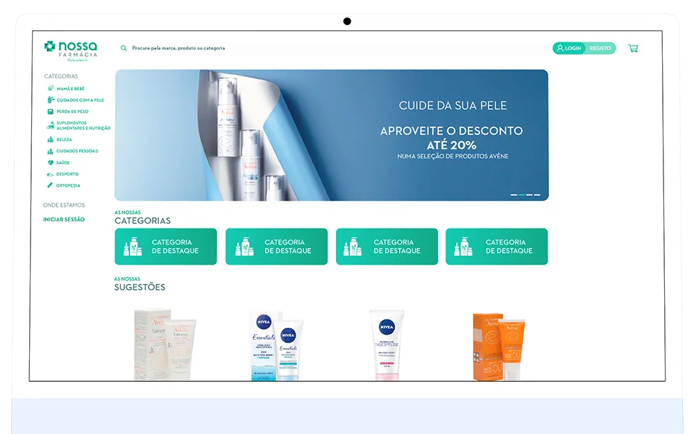
- Online store: Focused on detailed product information and on comparing options. Designed for a more considered, informed shopping experience.
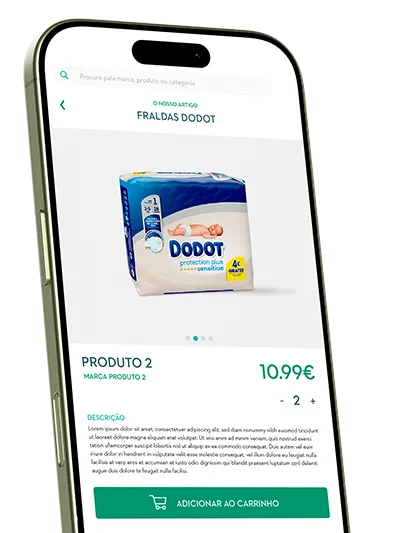
- Mobile app: Direct and accessible use, prioritising speed and real-time tracking, with notifications about order status.
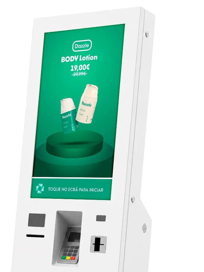
- Self-service kiosk: Occasional use with no login required. Designed for quick purchases with immediate pickup, ideal for avoiding queues at the physical pharmacy.
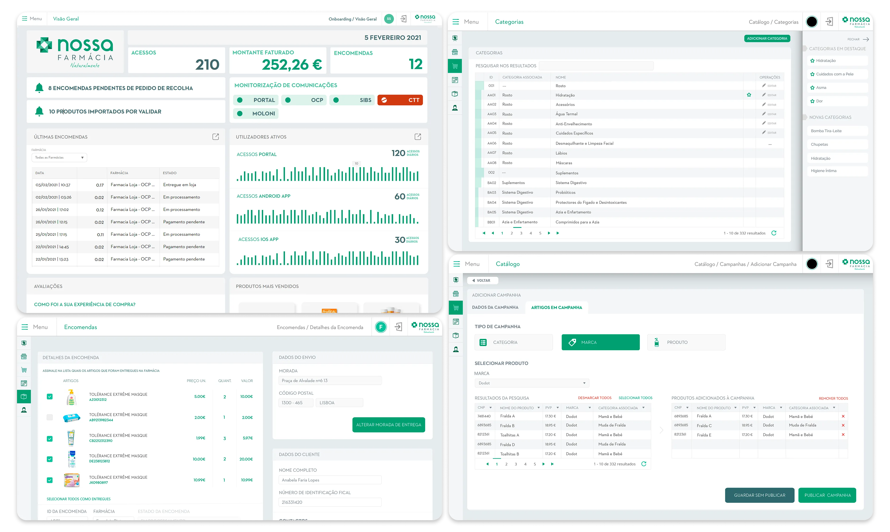
- Backoffice: Intensive use by operators, fully focused on efficiency and on managing the catalogue and orders at volume.
The Process
My role was central from the very first moment of the project: I was responsible for creating the UX/UI of the proof of concept, which defined the foundations of the entire ecosystem developed afterwards.
1. Research and information architecture
I defined the information architecture for the four platforms, mapping the flows and content they shared (catalogue, associated pharmacy, orders) and those specific to each context of use.
2. Shared design system
I designed a universal design system with components, tokens and interaction patterns shared across all platforms. The rules were adapted to the context of each channel, always maintaining the product’s visual and functional coherence.
3. Wireframes and prototypes
I created high-fidelity wireframes and prototypes for each platform, ensuring direct validation with the client before the development phase began.
4. Front-end implementation
As the project’s design and creative direction lead, I developed the front-end of the online store in Angular and of the kiosk in Javascript / jQuery. I also worked on the development of the mobile app in Cordova / Ionic / Angular and of the backoffice in .NET / Telerik, in close collaboration with the client and with the front-end and back-end teams.
For more details on the design process, see the case study on Behance.
The Solution
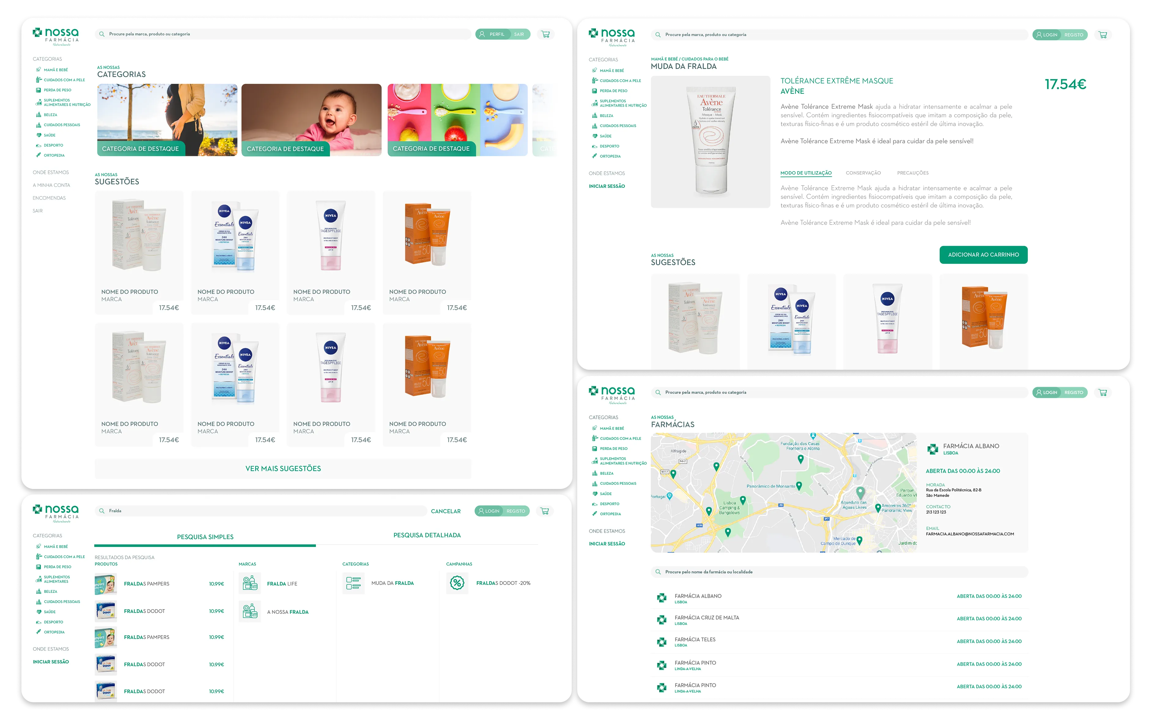
Online store
Navigation was designed for product exploration, integrating the choice of partner pharmacy throughout the entire purchase journey, from stock lookup to checkout. This kept the physical pharmacy present at every step of the experience, even in the online channel.
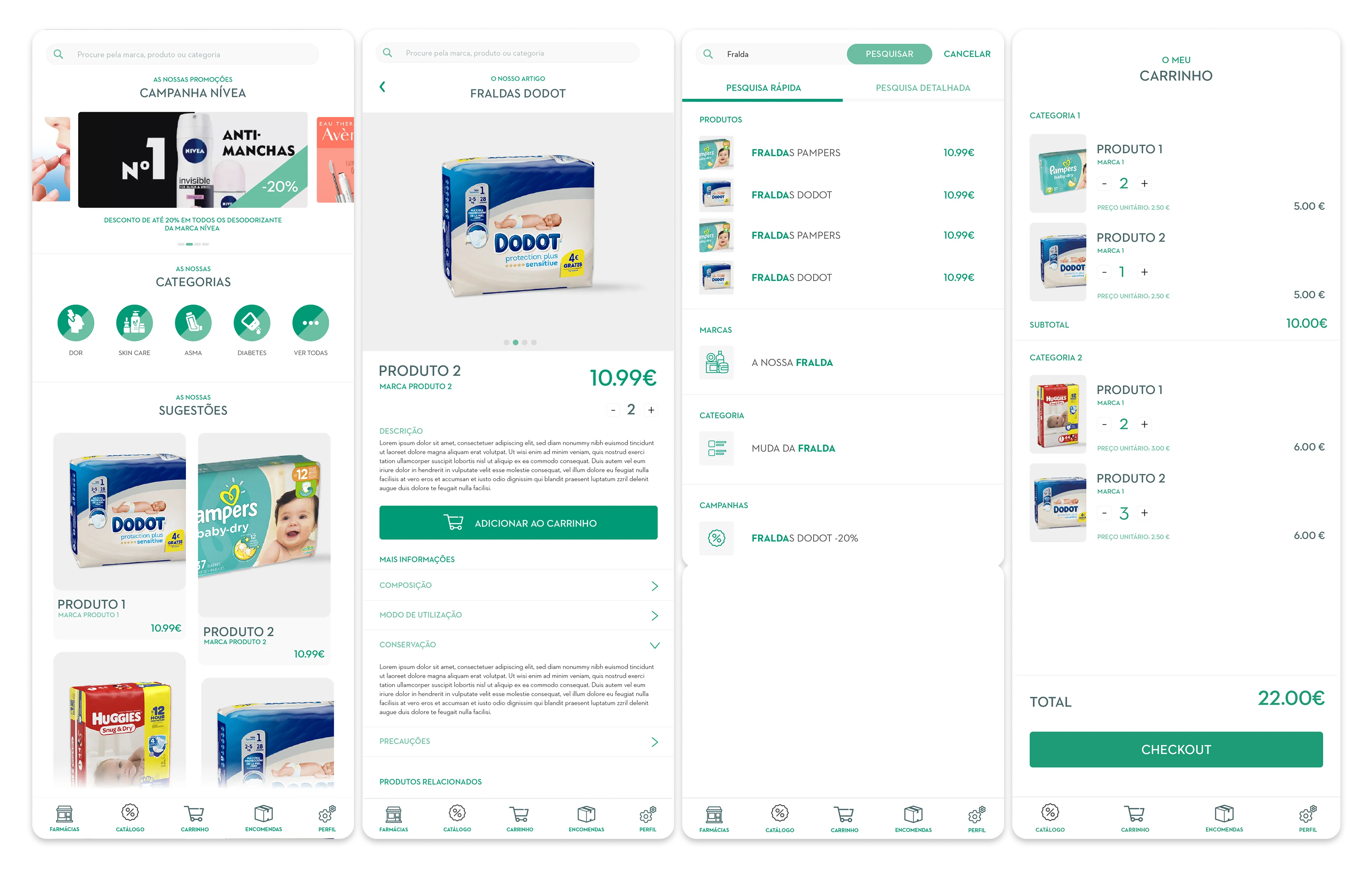
Mobile app (Android/iOS)
Designed for recurring use, focused on speed and re-ordering, essential for cases like chronic medication, where customers buy the same product regularly and value the shortest possible flow.
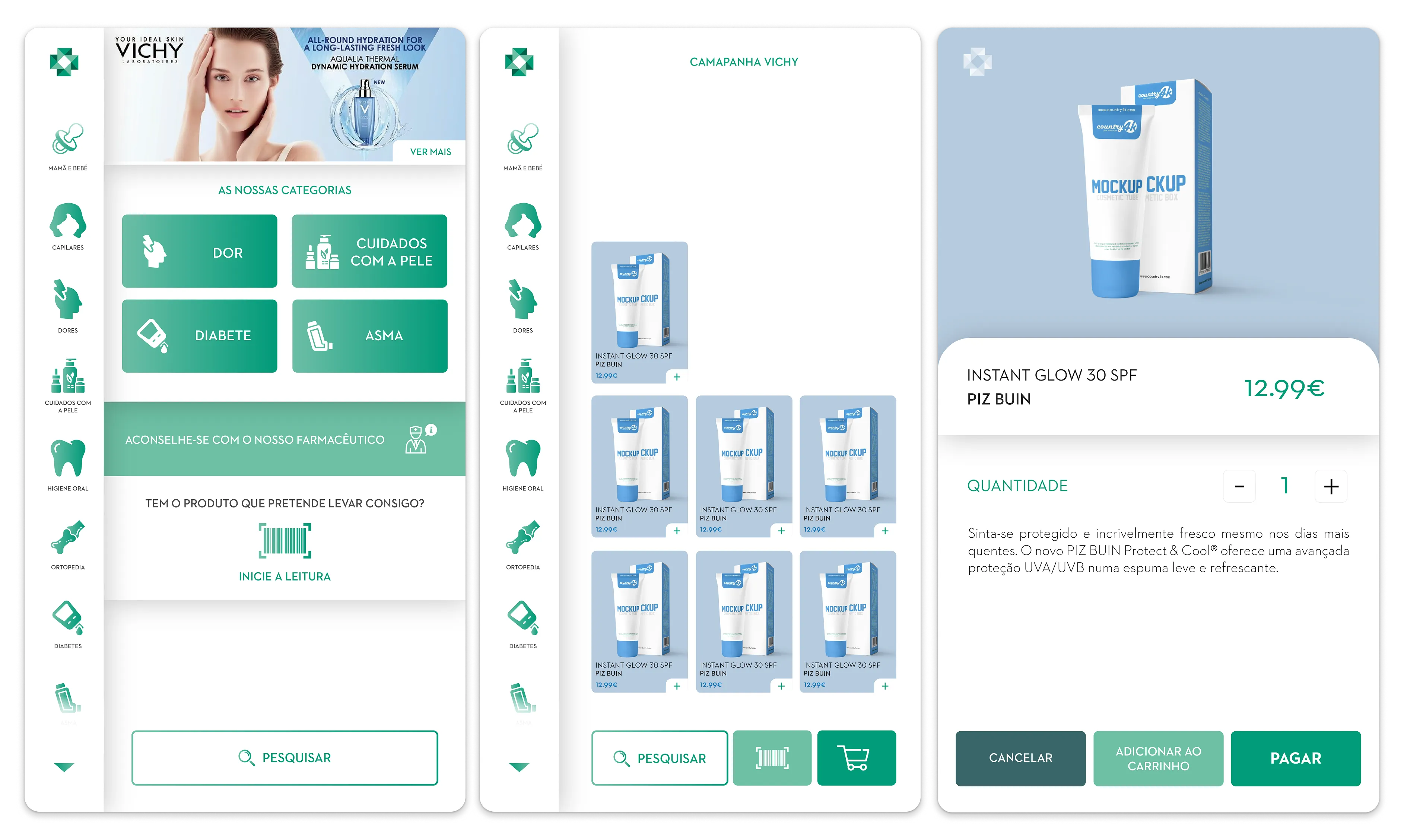
Self-service kiosk
An interface designed for occasional, frictionless use: no prior login, made to be used standing up and under time pressure, inside the physical pharmacy itself. Larger touch targets and a flow stripped to the essentials, adapting the design system’s patterns to this more demanding context of use.
Backoffice
Centralises the operation, catalogues and orders of the associated pharmacies, focused on efficiency for intensive use by operators who manage a high volume of information daily.