From physical card to phone: streamlining validation on navegante
- UX/UI Design
- Adobe Creative Cloud
- Adobe Illustrator
- Figma
- Maze
- Miro
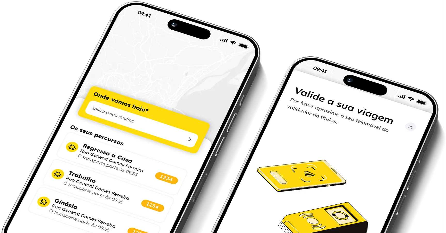
navegante is a final project for the Specialized UX/UI Design course (2023), focused on redesigning the ticket purchase and validation experience across Lisbon’s metropolitan transport network (bus, train, metro and ferry). I led the research, defined the information architecture and designed the high-fidelity interface for a concept mobile app, validated through a user survey and usability testing.
The Problem
Buying and topping up a pass in the Lisbon metropolitan area still means visiting a physical kiosk or an ATM, while validation requires always having the card on hand. In the survey I ran for this project among AML commuters, 69% said they had missed a top-up deadline at least once, and 77% admitted to having forgotten the physical card itself at home. The result: unexpected costs from buying single tickets on board, extra walks to terminals, and the inevitable queues at kiosks at the start of every month. INE data shows public transport accounts for less than a quarter of trips in the region, and a Moovit Insights study found that being able to buy and validate trips directly on a phone was one of the most requested improvements for boosting network usage.
The challenge: How to move pass purchase, top-up and validation onto the phone commuters already carry in their pocket every day?
The Process
The text below summarises the project’s main stages. For the detailed research, wireframes and full screen flow, see the case study on Behance.
1. Research
I grounded the initial analysis in INE data and the Moovit Insights study, then moved on to my own survey of AML commuters to map where the top-up and validation steps hurt most. Based on those results, I built a persona for a user who frequently forgets to top up her pass ahead of the usual start-of-month queues, and mapped the customer journey to pinpoint exactly where the experience breaks down.
2. Benchmark and competitive analysis
Looking at the market, I found that apps like Moovit or Pick Hub cover only parts of the process, and none allow on-vehicle validation in Portugal. To understand what already works well elsewhere, I looked at cases like Paris (Navigo) and London (with contactless and NFC since 2014). This analysis helped define the core features: NFC validation, a flexible digital wallet (QR code, NFC or manual entry), route search and quick access to the most frequent trips.
3. Information architecture and low-fidelity prototype
I organised the app’s structure into three main areas - Routes, Schedules and Passes - and put a low-fidelity prototype to the test with users on Maze. The results showed that 90% found it very easy to link a navegante card to the app, and the validation shortcut on the home screen was the most used option. Low engagement with the secondary footer navigation led me to restructure it before moving to high fidelity.
4. High-fidelity UI
I designed the high-fidelity interface, covering the whole primary flow: searching and buying a route, validating the pass via NFC, and linking a physical navegante card to the account.
For the full research, wireframes and UI screens, see the case study on Behance.
The Solution
A concept app that puts the whole Lisbon public transport journey - searching routes, buying tickets, validating them, and managing or linking the physical pass - directly on the phone, removing the need for kiosks, ATMs or physical cards.
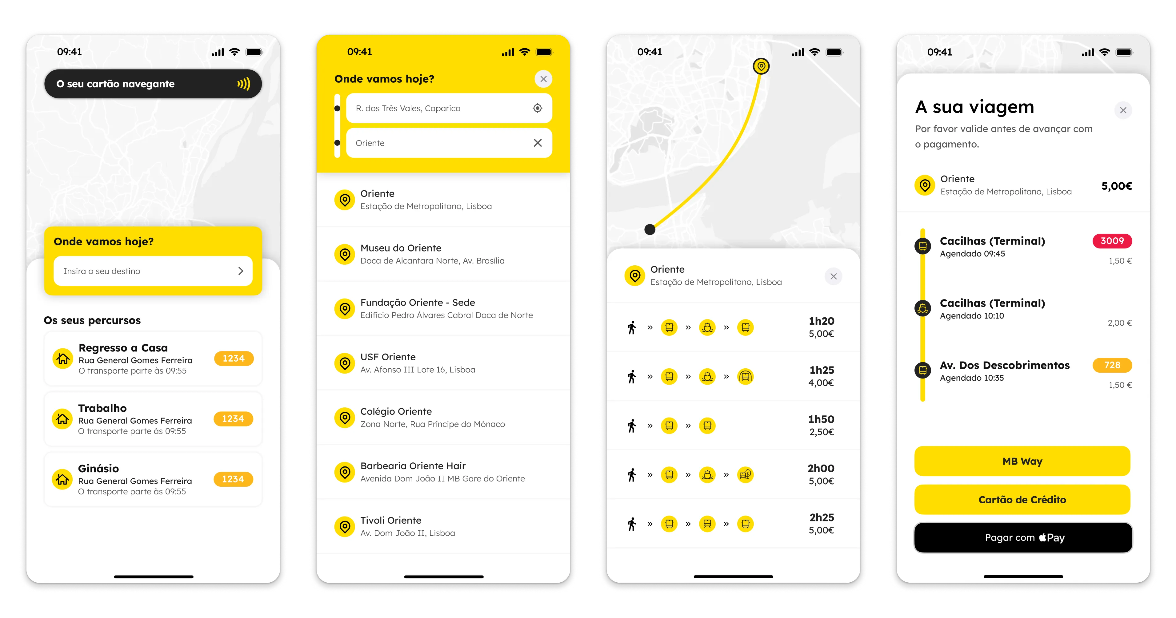
Route search and purchase
Search for a destination, compare route and price options, and buy directly from the results - with saved and recent routes highlighted on the home screen for repeat trips.
Ticket validation
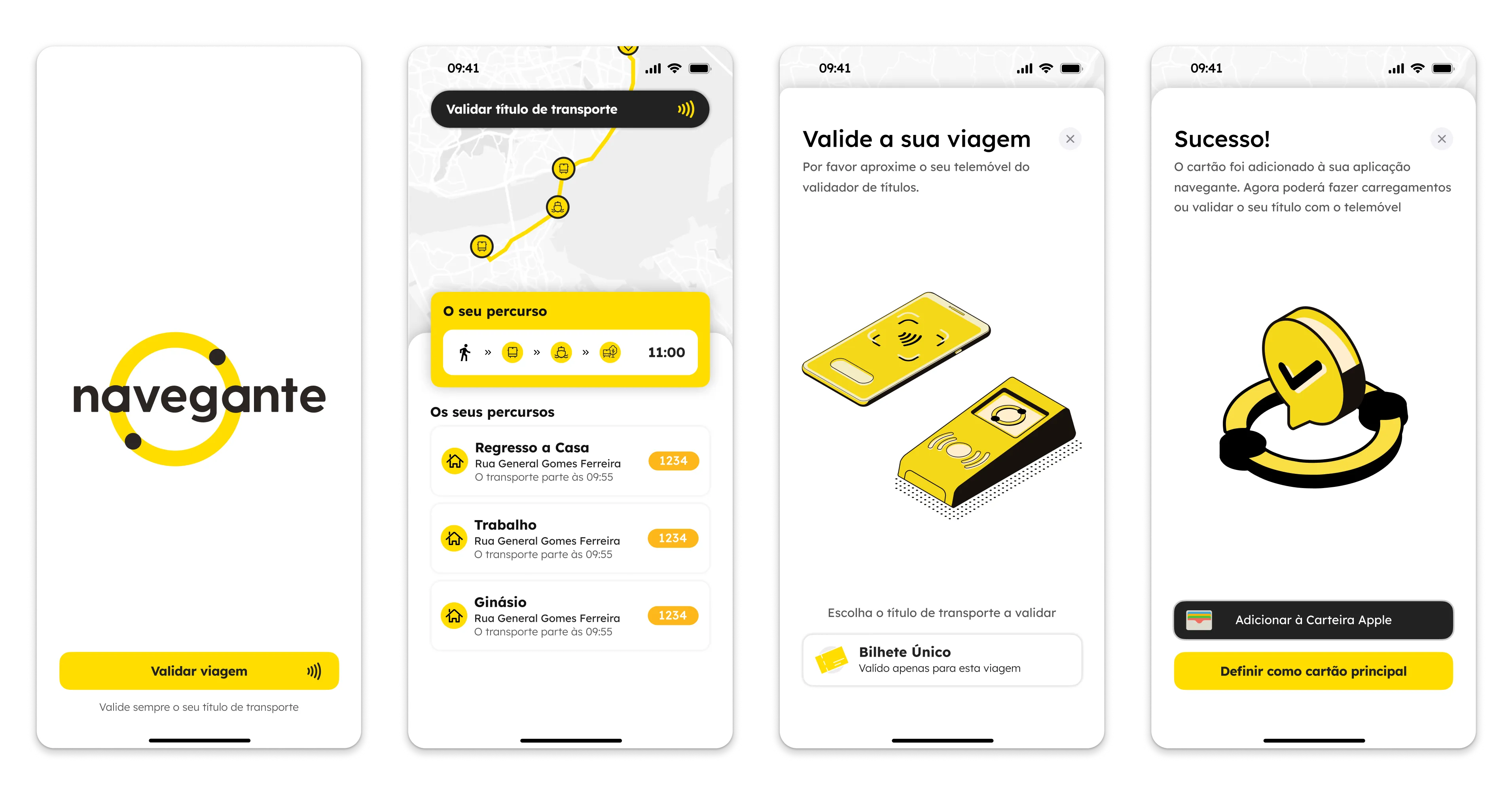
Validate a ticket by tapping the phone against the validator, with NFC replacing the tap of the physical card, and a confirmation screen closing the flow before the trip begins.
Linking a navegante card
For trips that still require the physical navegante pass, users can link it to the app via NFC, keeping top-ups and validation status in one place from then on.
For the full research, wireframes and UI screens, see the case study on Behance.