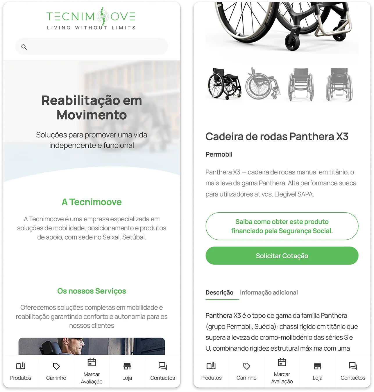
Online store for mobility and rehabilitation equipment
- Front-End Development
- Figma
- HTML / CSS / Javascript
- WordPress
- WooCommerce
Tecnimoove specialises in mobility, positioning and assistive-product solutions. Its audience looks for a buying experience that combines accessibility, personalisation and rigorous technical guidance. As a freelancer, I designed and developed the brand’s institutional website and online store, from wireframe to deploy, with particular focus on the home-assessment booking flow and the integration with the Social Security state-funding programme.
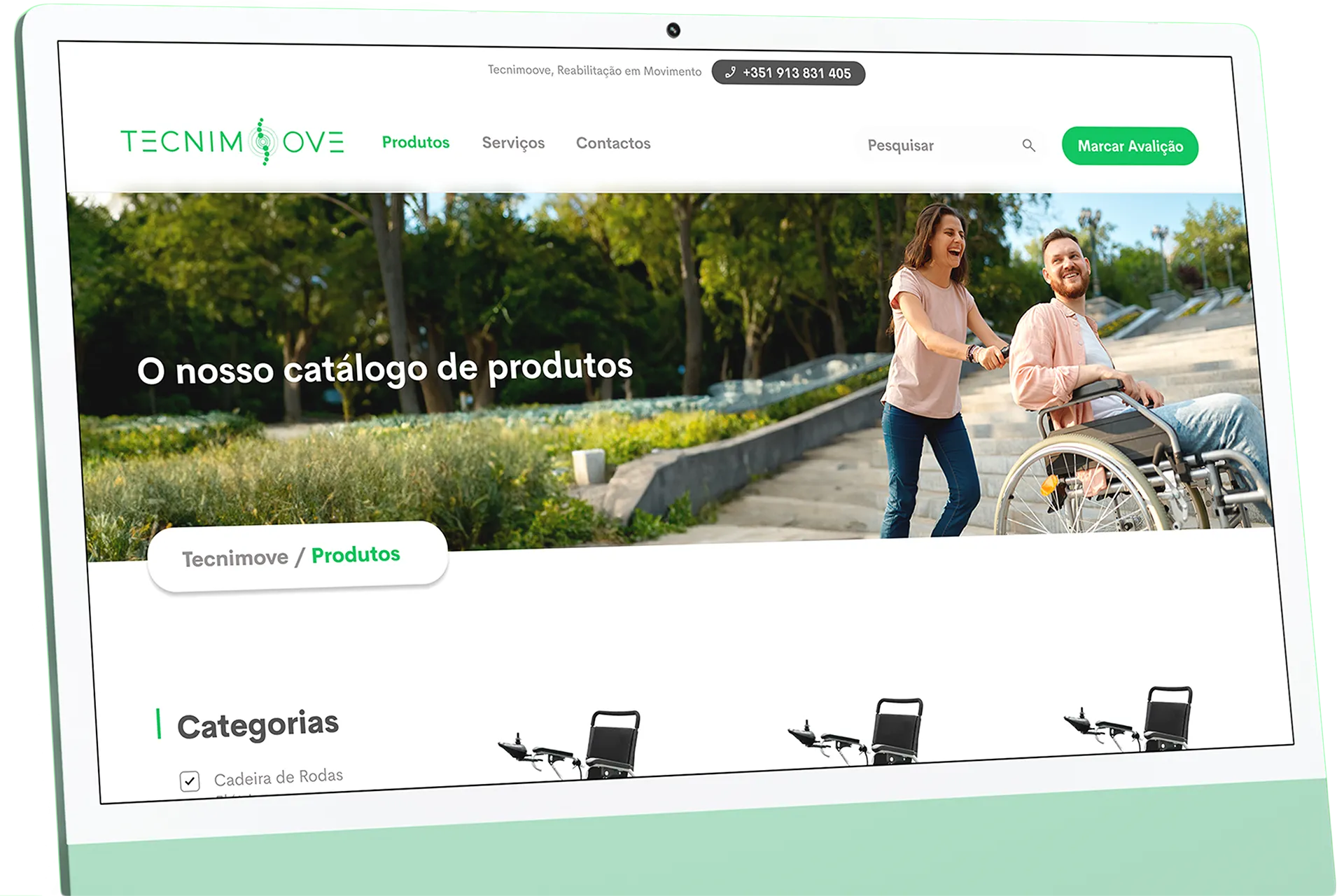
The Challenge
Tecnimoove sells mobility equipment to an audience with specific needs (elderly people, caregivers and people with reduced mobility), whose purchase decisions are heavily shaped by awareness of state support schemes. The core UX challenge was that many customers qualified for SAPA funding (Social Security) but gave up or never found out about the process because of its bureaucratic complexity, something a conventional online store tends to ignore.
To solve this, the platform was designed to integrate the funding scheme directly into the purchase journey. By clearly flagging eligible products, simplifying the information and guiding the user through the application and technical assessment, the store became not just an e-commerce catalogue, but also an accessible guide and an effective channel for capturing qualified leads.
The Solution
The solution centred on designing an experience built around accessibility, trust and technical guidance. Navigation was structured around functional categories and real product photography to ensure maximum clarity and credibility.
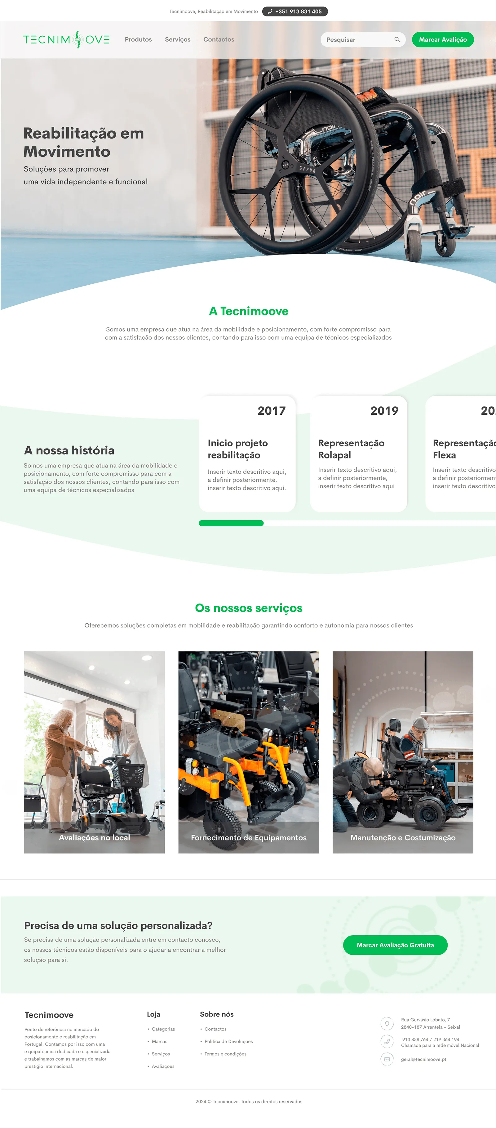
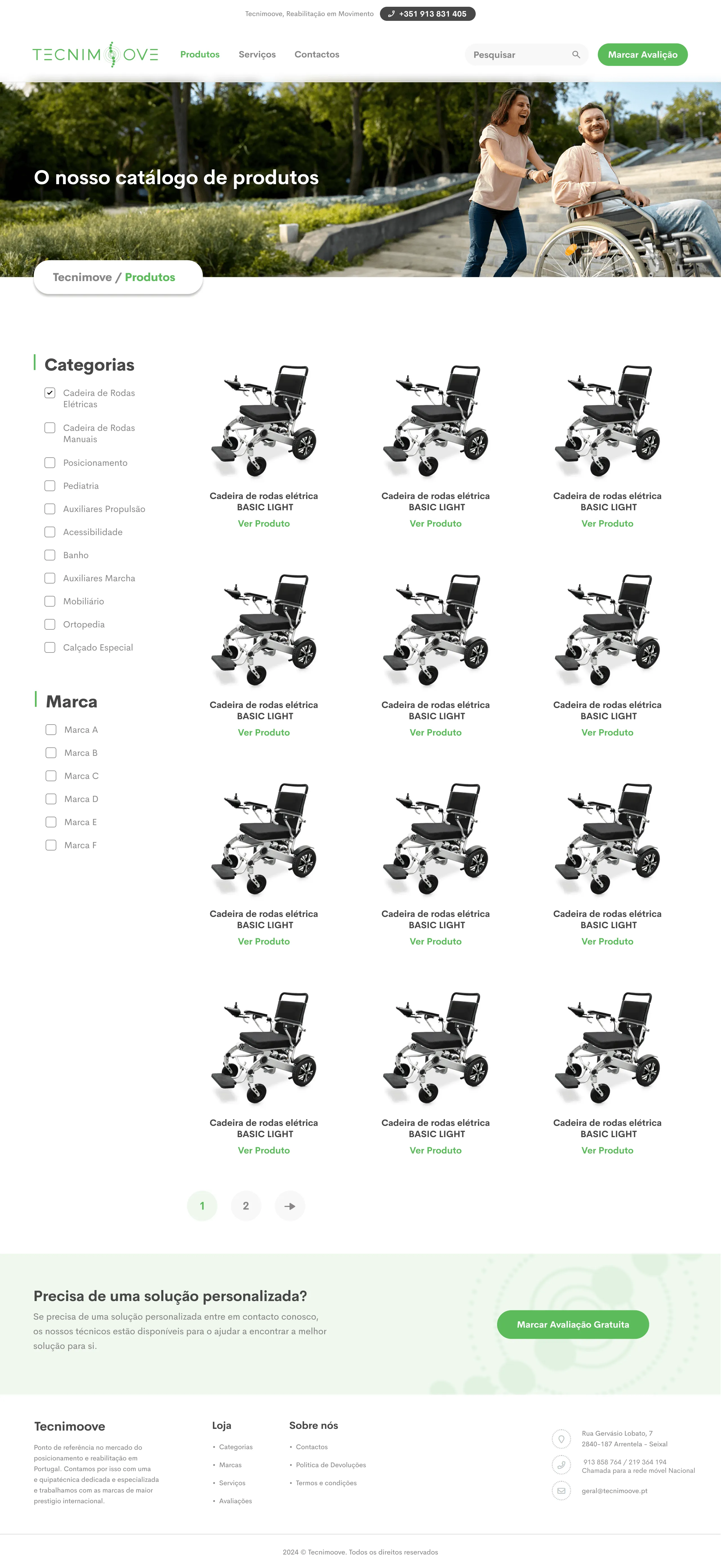
On the homepage, trust comes before the sale: the three pillars of the business (on-site assessments, equipment supply and maintenance) and the brand’s partnership history are presented right away. From there, the Catalogue organises products alongside practical, clinical context on what problems they solve, guiding users who are still assessing their needs.
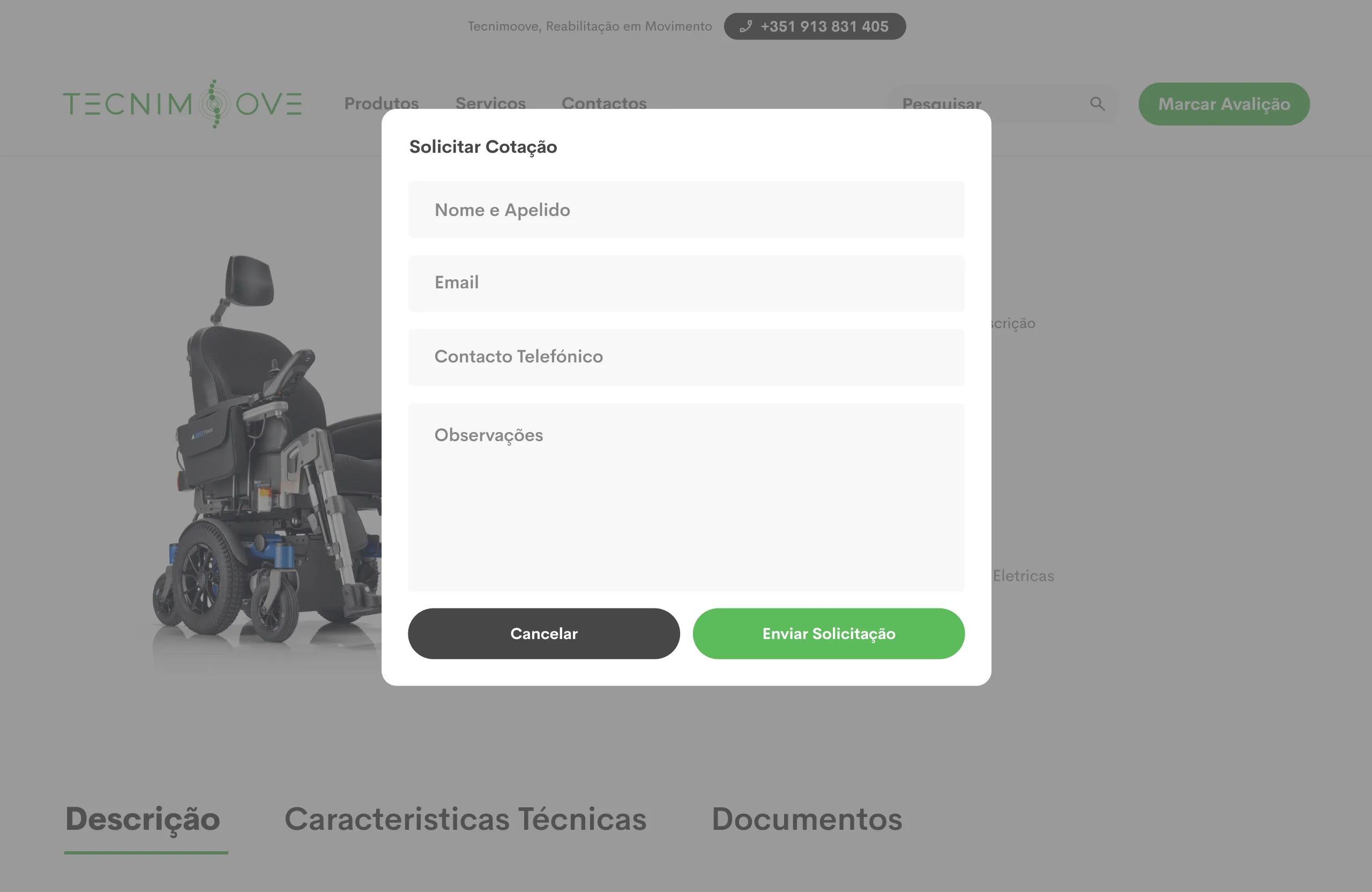
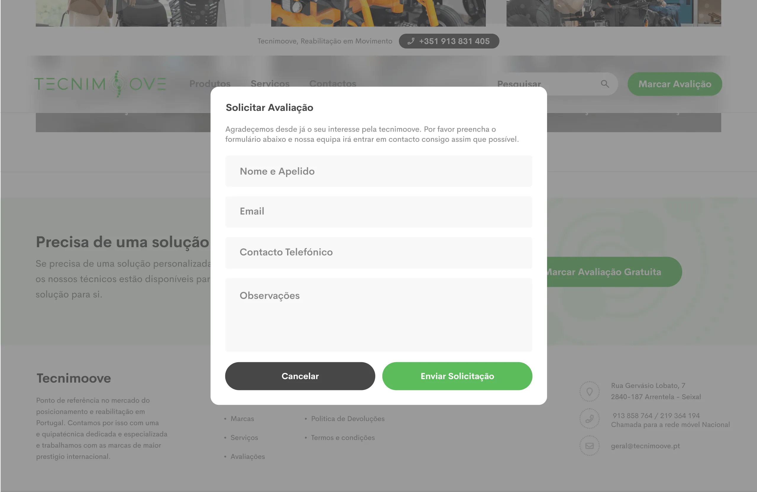
On Product Detail pages, clear signposting of SAPA funding eligibility pairs with a key UX decision: splitting the experience into two parallel conversion flows. While consumables follow the classic direct-purchase path, complex equipment redirects to Quote Requests or Assessment Requests (with a fixed CTA in the header), replacing the “add to cart” button with a request for a technical home visit from a specialist.
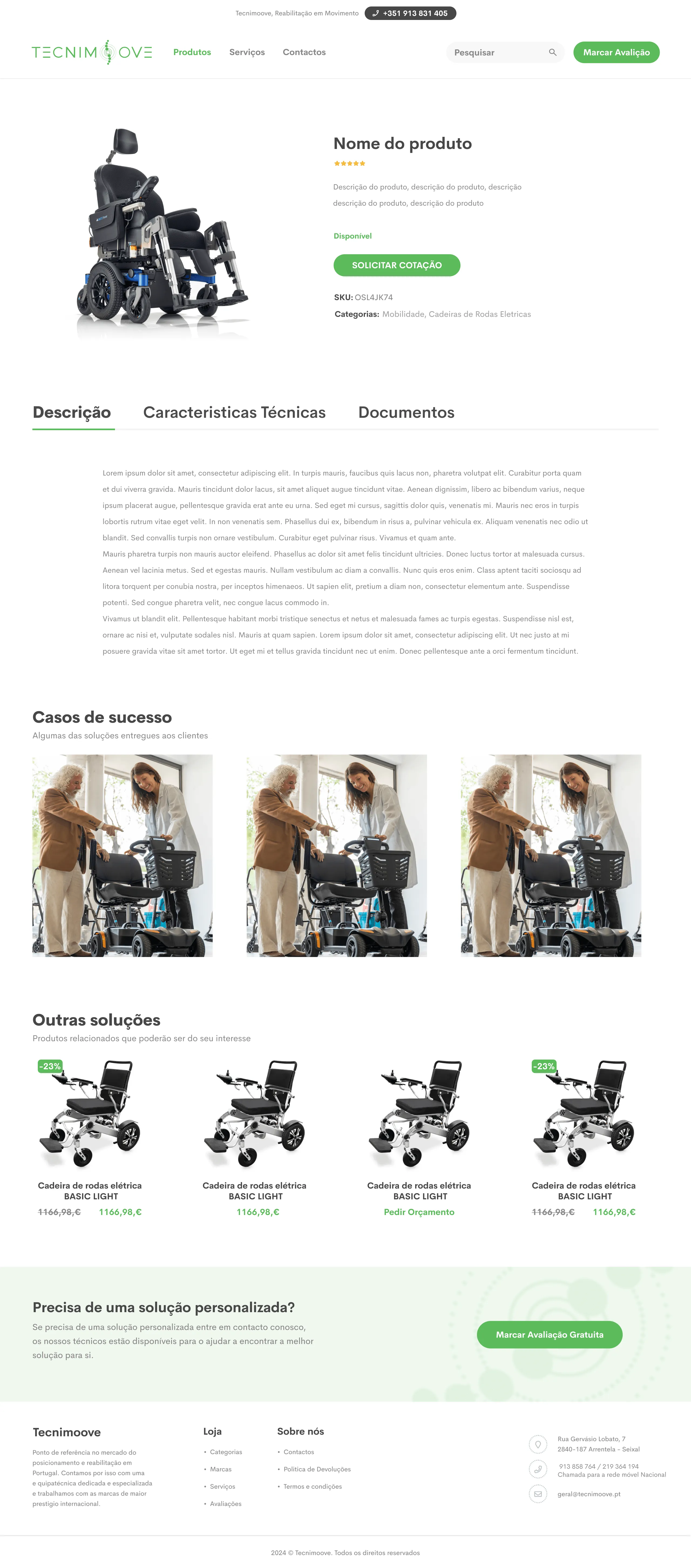
The whole platform was optimised for smooth navigation on any device, keeping technical specifications, short forms and checkout as simple and legible as possible on the Mobile Version, which is decisive for local search.